My Kite
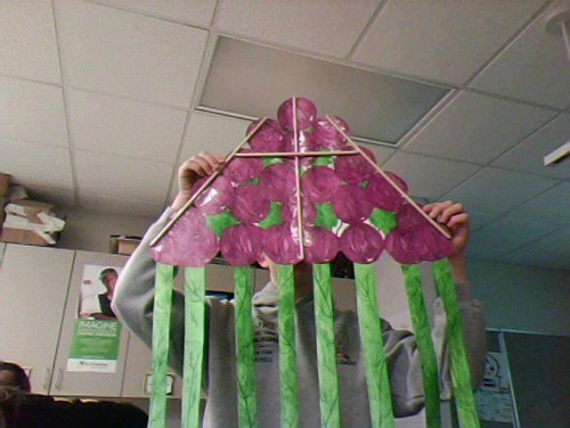
This is the overall photo of my kite. My kite is a bunch of grapes with vines as tails!
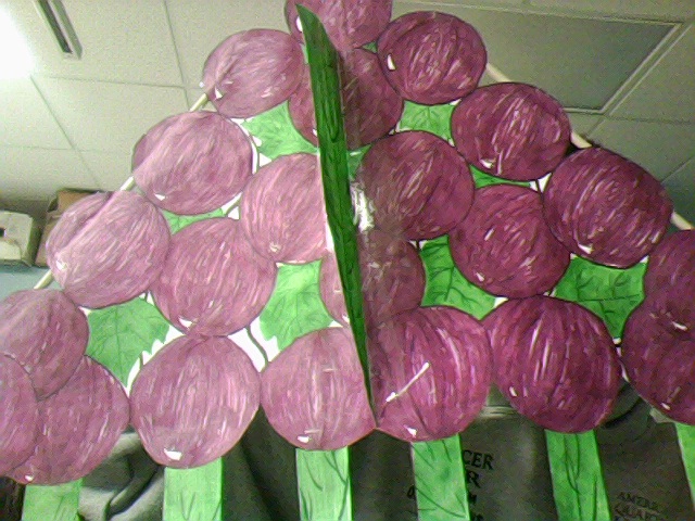
This photo is of the underneath side of my kite with the fin. I liked this side better because the grapes are in more detail and have better color.
|
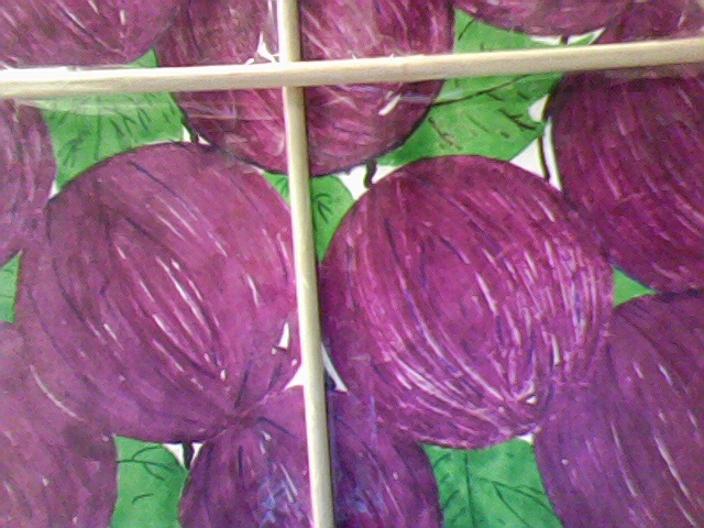
This is a close-up of the back of my kite where the dowels are. You can see the intersection of the spreader bar and the main dowel.
|
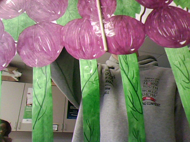
Here you can see the bottom of the kite, where the tails are attached to the base of the kite.
|
Preliminary Designs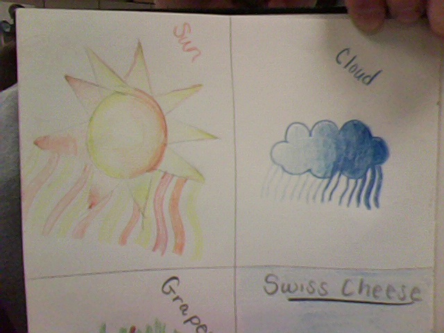
Here are two of my preliminary designs. I decided to go with two weather themes for these pre-lims.
|
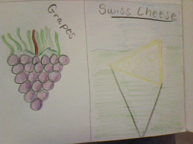
Here are two more of my pre-designs. I used a food theme to draw on triangle kites.
|
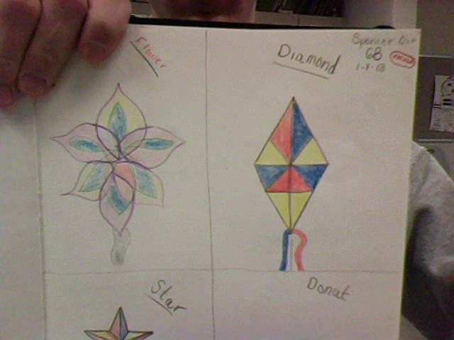
These are my first two desings using primary colors.
|
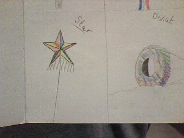
Using primary colors, I drew these two. The one on the right is called a bowl kite, and is more of a ground bouncer.
|
Kite Reflection
I feel that one of the good or strong points of my kite is the amount of detail put into the grapes and leaves because I put a lot of time in while coloring them and it makes the kite look nicer. I think I could have done a better job at taping on my spreader bar because it does not look that professional. My kite is a triangle shape and it has a fruit theme. I picked a bunch of grapes because I thought it would be easier to draw on a triangle kite. I picked a triangle shape because it works with my theme. The major color family in my kite is cool colors. I used a reddish purple color because it most looks like a grape. Building my kite wasn't that challenging, but it was very time consuming. I figured out I do not like coloring with sharpie that much, but do realize that nothing else would color on the Tyvek. I do like how strong the Tyvek is and that the sharpie is permanent because then my kite won't rip or lose its color. Through this project I learned how to manage my time wisely and that you need to be exact and precise while working on a project. I also learned it is better to have a plan before you begin a task because it will help you along the way. My first step in doing this project was to make sure that my kite was symmetrical. Then, I began coloring the outer grapes to ensure that each round edge would have a grape. I then drew the inner grapes and the leaves. Next, I repeated this process and the other side of my kite. Now, I was ready for my tails and fin. I decided to go with a leafy pattern to make them look like vines. I didn't mind this project at all. I would agree with my classmates that it was stressful at times, however I enjoy seeing my finished kite and knowing that I created it from ultimately paper and sticks. I would recommend possibly adding more time so more of us could have tried going for exceeding.
